When renovating your home, one of the most important questions is what color you will paint your rooms! It’s an overwhelming decision, as it is one of the largest decisions that people make, and will be seen at every moment. There are countless options to choose from, and it’s important to pick the right color for you. Whether you choose to go trendy or classic, here are a few pieces of advice and color recommendations!
Kitchens
For kitchens, the paint color must be connected to the cabinets, so cohesion is essential. Very common paint colors are soft whites, warm neutrals, and earthy tones. An accent color is a great choice, and usually corresponds to the rest of your kitchen. Beyond the cabinets, it is crucial to coordinate your paint choices with hardware and fixtures. The finish of your pulls, knobs, and faucets should complement the wall color to create a polished look. Even specialized additions like pot fillers should be considered in this color story.
Lighting also plays a pivotal role in how color is perceived and how the space functions. Elements like undercounter lighting can change the appearance of your backsplash and countertops, making it vital to test paint samples under both natural and artificial light. By harmonizing your paint with these functional details, you ensure a kitchen that is as beautiful as it is practical.
Living Rooms
The living room is often the heart of the home, so you want a color that feels inviting and versatile. Light grays, soft blues, and muted greens are popular choices that create a calming atmosphere while allowing your furniture and decor to stand out. If you want a more dramatic feel, consider a deep navy or a sophisticated charcoal for an accent wall to add depth and character to the space.
It’s also important to make sure you match your living room paint color to the rest of your home. If your home is open concept, a great choice is neutrals, so that it matches throughout the house.
Bedrooms
In the bedroom, the goal is to create a safe space for rest. Cool tones like lavender, sage green, and misty blue are excellent for promoting relaxation. For those who prefer a warmer environment, sandy beiges and soft terracotta shades can make the room feel cozy and snug. Ensure the color complements your bedding and window treatments to maintain a peaceful, harmonious vibe. If you want a very smooth, comfortable room, starting with a calming color will anchor the room, and can be versatile as furniture or decor is changed out.
Bathrooms
Bathroom colors are important, but are very dependent on the bathroom’s theme. Common colors for bathrooms are whites, beiges, and neutrals, but another is blues. Light blues are a great choice for bathrooms, and match many tile options. Color drenching is always a great choice for bathrooms, and can provide great personality to the space.
Offices
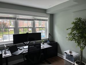
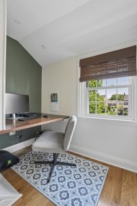
If you have an office, picking the paint color is important, especially if you work remotely. Whites, beiges, and neutrals are versatile and smart, but there are also colors that specifically promote focus, including soft blues, sage greens, and warm neutral greys. These colors lower eye strain, which can help to lower stress. After looking at a screen, lowering your eye strain in any way is essential, and can help your health long-term.
But most importantly, your paint colors should make you happy and match your space! Paint colors are more easily changed, but can be hard to decide! If you need any help with deciding colors, Penn Construction & Design is here! Contact us today at (484) 452-5071, or visit our showroom at 8 Campbell Avenue, Havertown, PA.